CoConstruct Component Library
I developed the CoConstruct Design System to create visual and functional consistency across the company’s marketing website and HubSpot sales landing pages. The goal was to establish a centralized, scalable foundation that aligned designers and developers while eliminating duplicated or inconsistent UI elements.
Problem
As the marketing site expanded and new sales landing pages were created in HubSpot, inconsistencies emerged in styling, spacing, and component usage. There was no single source of truth for:
Design tokens (colors, typography, spacing)
Reusable UI components
Documentation for how components should be implemented
This created inefficiencies, increased the risk of duplicated components, and made maintaining visual consistency difficult.
The Solution
I built a centralized design system using Storybook and React, translating existing Webflow components into a structured, standalone component library.
Key elements included:
Design Tokens: Standardized color palette, typography scale, spacing system, and reusable variables.
Reusable Components: Buttons, form elements, layout structures, and marketing components are documented and ready for implementation.
Component Documentation: Clear usage guidelines so designers and developers could reference, reuse, and extend components without recreating them.
Cross-Platform Alignment: Ensured consistency between the Webflow marketing site and HubSpot landing pages.
Challenges
One of the primary challenges was migrating Webflow-built components into a standalone Storybook environment. Webflow components are visually structured but not inherently modular, unlike React components.
My solution:
Deconstruct Webflow layouts into reusable, logic-based React components.
Abstract styling into reusable tokens and variables.
Rebuilt components in a modular way to ensure scalability and long-term maintainability.
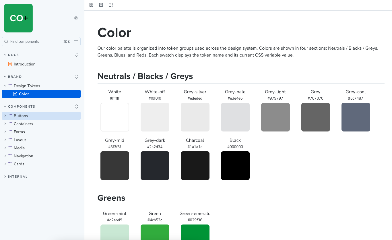
CoConstruct Design System color tokens documentation showing brand palettes and semantic color definitions.
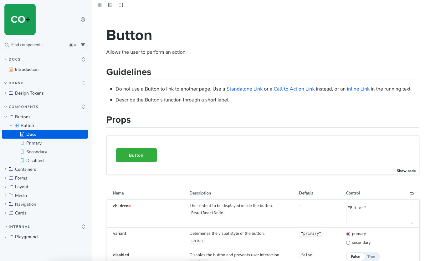
CoConstruct Design System button component documentation showing variants, states, and usage examples.
The Results
Deliverables
A fully functional Storybook component library
Documented design tokens
Reusable React components ready for implementation
A centralized reference for both design and development teams
Outcome
The design system established a shared language between design and development, reducing duplication and reinforcing brand consistency across platforms. It provided a structured foundation that improved scalability for future marketing initiatives.
Professional Growth
Developed a deeper understanding of how design systems create alignment between designers and developers by establishing a shared language and reusable patterns.
Strengthened my ability to translate visually built Webflow components into modular, scalable React components within Storybook.
Learned how to abstract UI elements into reusable design tokens (colors, typography, spacing), improving long-term maintainability.
Gained experience thinking beyond single-page implementation and toward system-level architecture and scalability.
Improved cross-functional collaboration skills by working closely with a designer and content writer to ensure consistency across marketing and sales platforms.
Built confidence in structuring documentation that supports both technical and non-technical stakeholders.