The Recipe Tin — Component Library
Recipe Tin UI is a React component library and design system built to support the development of a recipe discovery and cooking platform. Inspired by the nostalgic image of a kitchen tin stuffed with handwritten recipe cards, the system translates that warmth into a modern, scalable digital product. The library delivers reusable components, design tokens, accessible interaction patterns, and full Storybook documentation — everything a design-engineering team needs to build cohesive recipe experiences from a single, shared source of truth.
Problem
Building a recipe application involves more than displaying food content. It requires interfaces that communicate nutritional data, handle user interactions like saving and rating recipes, and present a large variety of content — cards, galleries, ingredient lists, nutrition breakdowns — without visual fragmentation. Without a shared system, teams duplicate work, diverge on visual decisions, and ship inconsistent experiences.
The core problem was the absence of a systematic foundation: no shared tokens, no documented components, no alignment between design intent and engineering output. Each feature risked becoming its own island.
My Role
Design Engineer
Completed
2026
Technology
React
Storybook
Vite
Challenges
Designing for domain-specific complexity: A recipe app has unique UI needs that generic component libraries don't cover; caloric breakdowns, macronutrient progress bars, ingredient checklists, cook-time displays, and recipe-specific gallery layouts.
Establishing a token-first foundation: Creating a coherent color system, typography, spacing system, and border radius scale, and then wiring all of that into CSS custom properties that components could reliably consume, required careful upfront architectural decisions before a single component could be built correctly.
Accessibility from the ground up: Building components to meet accessibility standards (contrast ratios, keyboard navigation, focus states, screen reader support) isn't a layer you add at the end. It had to be embedded into every component's design and implementation decisions, which added rigor and constraint to the entire process.
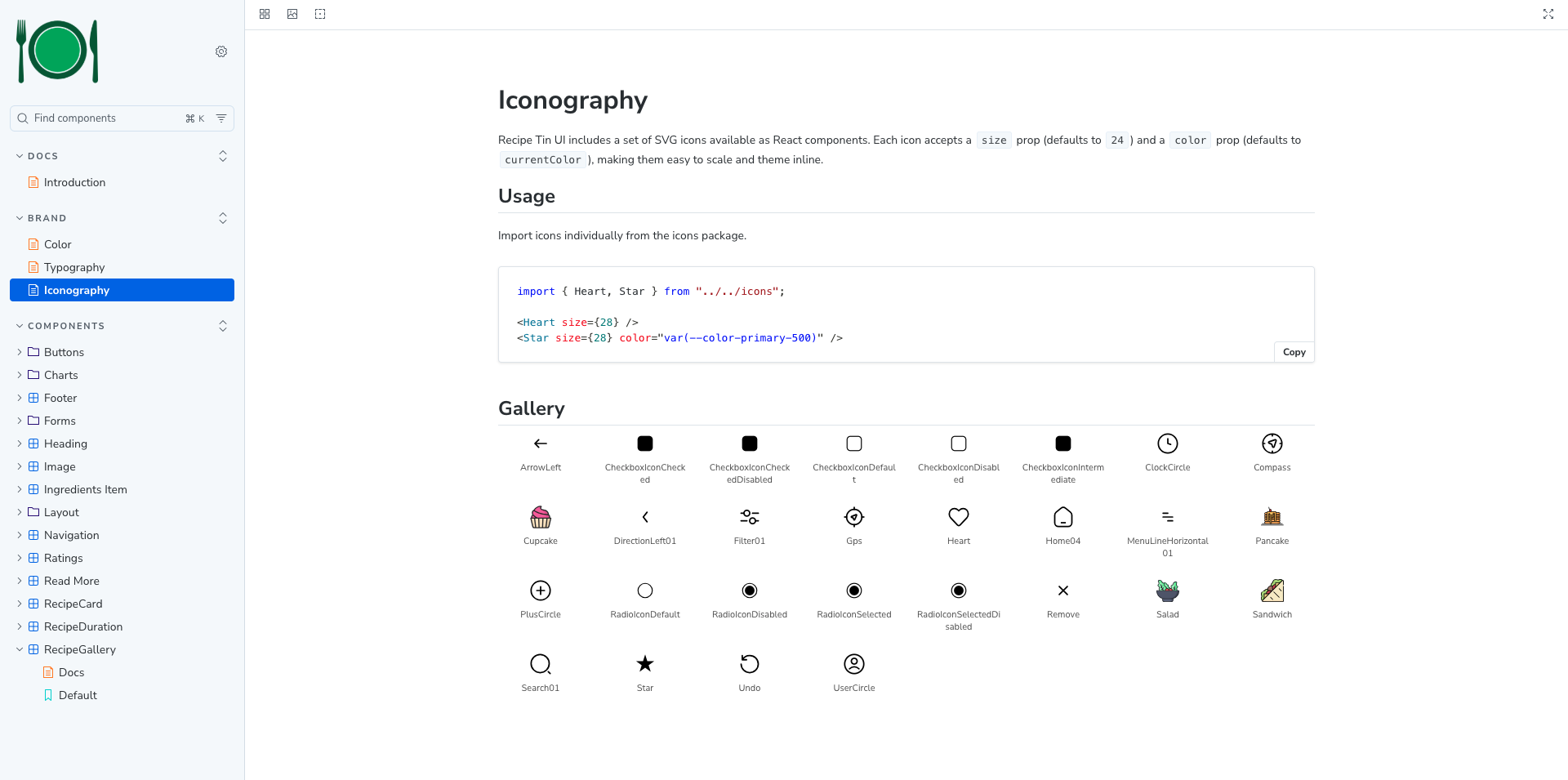
Tree-shakeable icon architecture: The icon set needed to be consumable independently of the component bundle — pulling in a single icon shouldn't require the consumer to pull in the entire icon library. Structuring the icons as a separate entry point with auto-generated React SVG components from source design files required a build process that didn't exist initially.
Documentation that scales: Writing usage guidance, accessibility notes, prop tables, and live examples for every component in Storybook while keeping that documentation accurate as components evolve.
The Solution
Design tokens were established first. Covering brand colors (primary green, secondary teal, tertiary indigo), semantic states (success, warning, error, information), a neutral gray scale, a heading scale, a text scale, spacing increments, and border radii. All components consume tokens rather than hardcoded values, making the system brandable and maintainable.
A composable component architecture was adopted, using primitive layout components (Stack, Inline) to control spacing and alignment, on which higher-level components like RecipeCard and RecipeGallery compose on top of. This prevents spacing from being scattered across individual component styles and creates a consistent, predictable layout language.
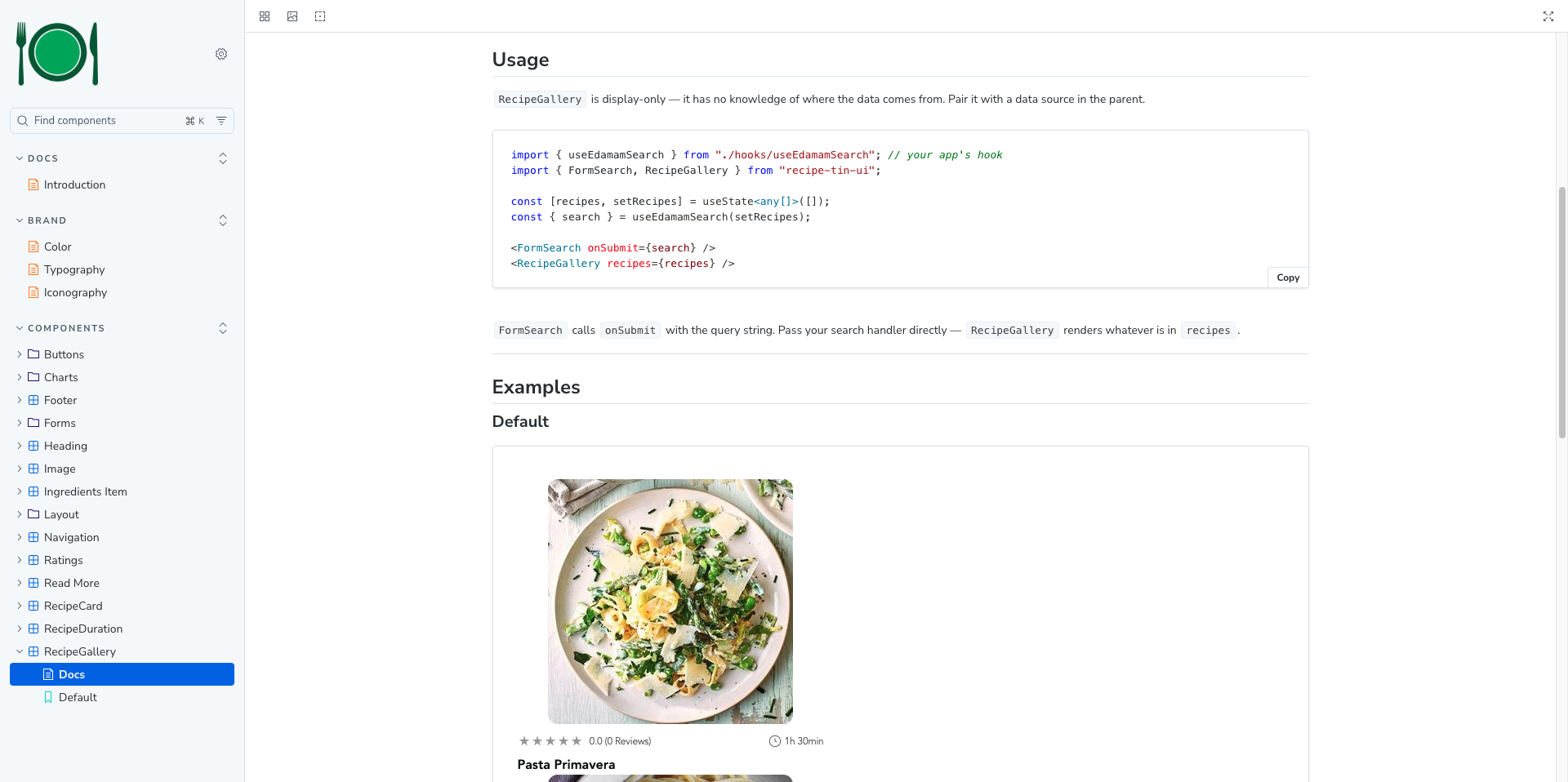
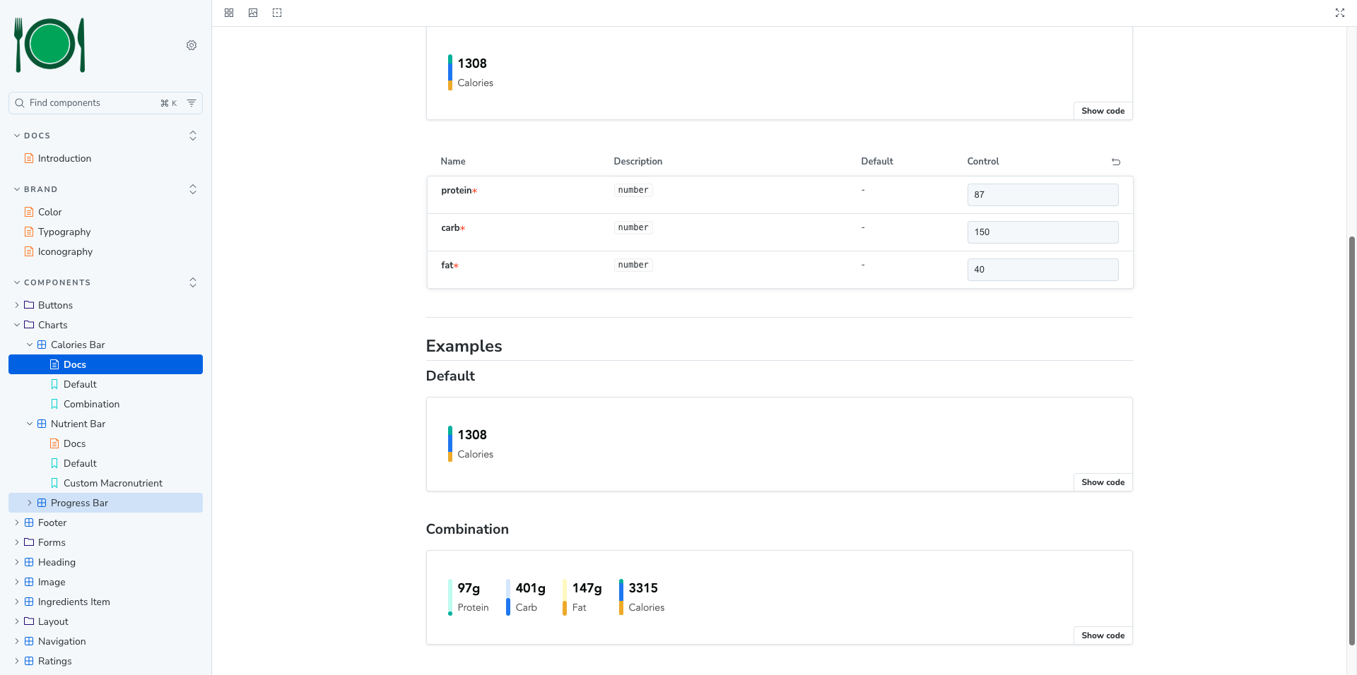
Specialized recipe-domain components were designed and built to create a CaloriesBar that calculates and visualizes caloric contribution from protein, carbohydrates, and fat proportionally. Also included is a NutrientBar and ProgressBar for macro tracking, a RecipeDuration and Ratings for at-a-glance recipe metadata, and an IngredientsItem for interactive ingredient checklists.
Icons were structured as auto-generated React SVG components from source design files, published as a separate entry point. Each icon accepts standard SVG props, making them composable and accessible.
Storybook was used as both the development environment and the living documentation platform, published to GitHub Pages. The full library with live examples, prop tables, and accessibility guidance is accessible without cloning the repo.
The Results
Deliverables
React component library with 20+ named exports covering form, layout, display, and data visualization categories, distributed via npm from GitHub with semantic versioning
Design token system exposing the full color, typography, spacing, and border radius vocabulary as CSS custom properties
Icon library with 25+ React SVG components available as a tree-shakable separate entry point
Storybook documentation site published to GitHub Pages with component examples, usage guidelines, and accessibility notes
TypeScript support with exported prop types for all components
CSS module isolation per component to prevent style leakage
Outcome
The result is a self-contained, installable design system that a development team can drop into a project with a single npm install command. Components are immediately usable, visually consistent, and grounded in a documented token vocabulary. The Storybook site acts as a shared reference point for both designers and developers, reducing ambiguity and shortening feedback loops between disciplines. The system is built to grow — new components can be added following established patterns without disrupting existing consumers, and semantic versioning ensures controlled, predictable upgrades.
Professional Growth
This project required operating at the intersection of design systems thinking and frontend engineering simultaneously — a discipline that demands breadth as much as depth.
Building the token layer first, before any components, reinforced the value of designing constraints intentionally rather than letting them emerge organically. It also made clear how much downstream work a well-structured foundation simplifies.
Developing domain-specific components like CaloriesBar — which required nutrition logic (calories per gram by macronutrient), proportional segment calculations, and visual representation of data in a small footprint — pushed beyond conventional UI work into small-scale data visualization.
Managing the icon pipeline from raw SVG source files through a generation script to typed React components deepened understanding of build tooling and the importance of separating concerns in a library's bundle architecture.
Perhaps most importantly, writing Storybook documentation for every component developed the discipline of explaining design decisions as clearly as implementing them — a skill as valuable in collaborative teams as technical execution.